
5 Metaball Animations in Jetpack Compose
Stunning gooey animations created in Jetpack Compose
In the last article, I used an AGSL shader to recreate the Dynamic Island animations. I was impressed with the results and continued playing around to make more metaball animations.
Before we begin
I created two helper composables to use while working on these animations.
The MetaEntity wraps any individual object that needs to be "gooey". It controls the "gooeyness" with the blur parameter. Other elements that should not be affected by the animation can be added in the content parameter.
The MetaContainer contains all the multiple MetaEntitys and applies the AGSL shader on all of them.
AGSL shaders can only be used from sdk 33
Now on to the animations!
1. Progress Loaders

This was the first obvious use of these animations. Any basic shapes with their translation, scale and rotation animated plus this gooey animation applied on them would result in a mesmerizing loader. In this example, I have an arc rotating in one direction and a series of circles, positioned in an arc, rotating the other direction
Code
2. Switches
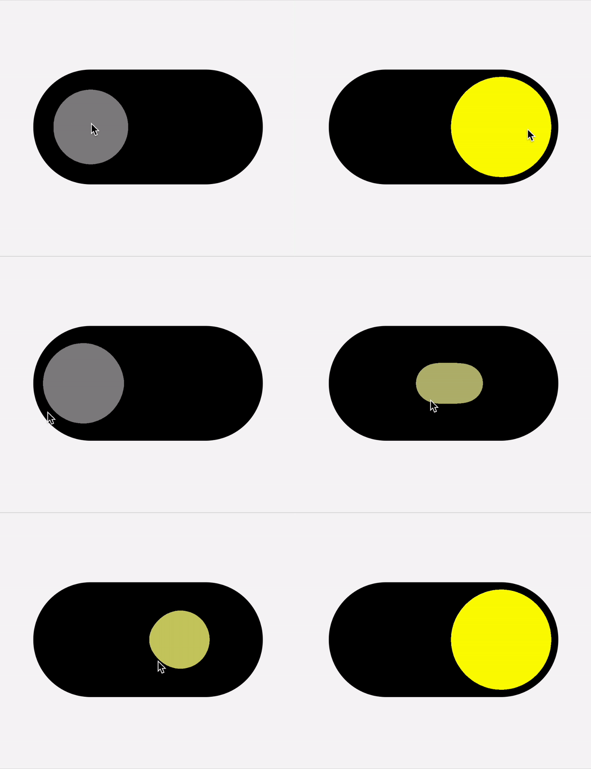
Here we have our first user interaction animation. The animation here adds some playfulness as the switch transitions from on to off.
I made two circles that move from left to right based on the user swipe. I then scaled the first circle inversely with the progress on the switch and the second circle proportionally with the switch progress. Wrap them in a MetaEntity plus a color transition and you have this.
Code
3. Expandable FAB
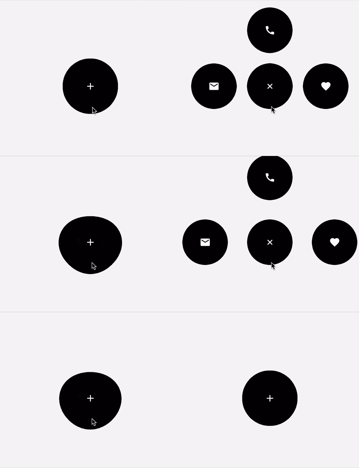
A FAB could house more user actions and we can present these in a delightful animation. Here I just have multiple circles with icons hidden under FAB. When the FAB is clicked, it reveals multiple options.
Code
4. Swipe to Dismiss
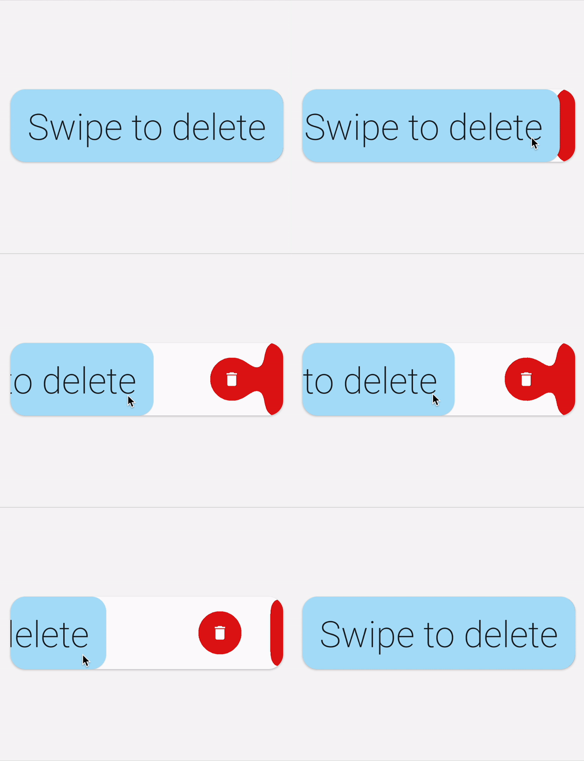
Behind the dismissible card, I added a metaball animation that comprises of a circular delete button and a static rectangle at the end. There is a connective horizontal rectangle connecting these two whenever the user has not swiped far enough to trigger an action. Once the swipe threshold has been reached, the connective rectangle disappears and the delete button bounces away.
Code
5. Bottom navigation
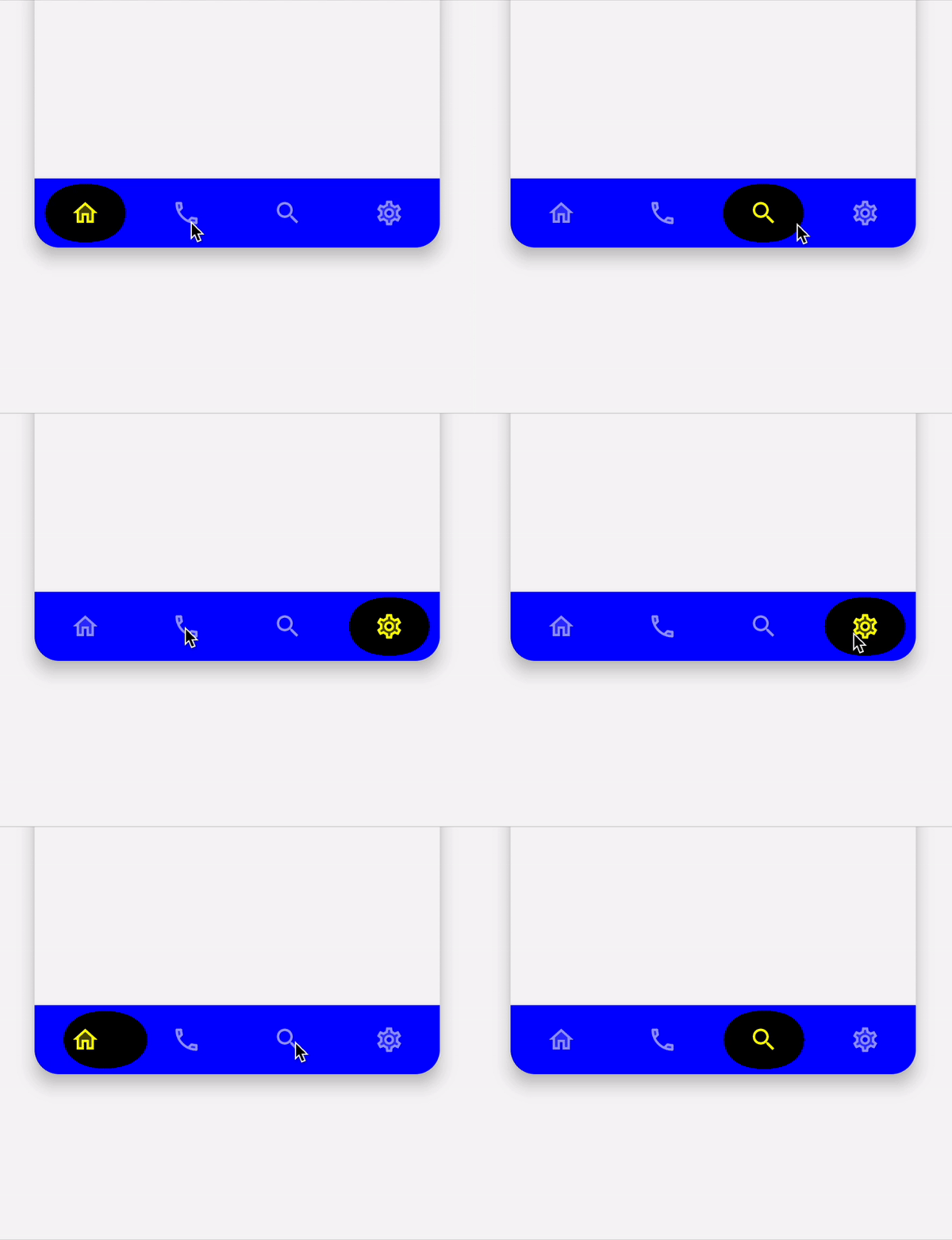
For the Bottom navigation indicator, I used a metaball animation that combines two circles. First circle animates to the currently selected item. The second circle does the same but is slower and has a bounce animation. Combined, they give the indicator a jelly-like feel in its movement.
Code
6. Text Change
I made this bonus animation to illustrate that with this method of blurring + shader, you could use it on any composable. It just takes a lot of experimentation and tweaking to see what works and what does not.
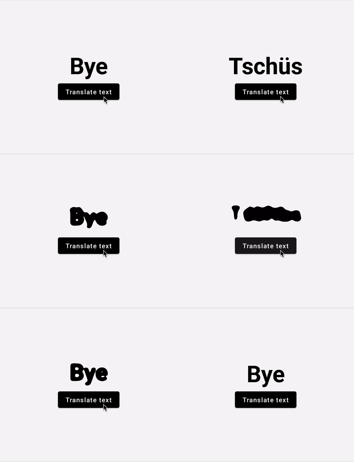
I experimented with making a text change animation. For this one, the text crossfades in and out. There is also a blur animation that goes from no blur, to full blur and back to no blur. When the AGSL shader is applied to this, it creates an interesting animation.
Code
The results that I have been able to achieve took a lot of trial & error to see what looked good. Experiment with these, make your own and show me what you come up with :)
Thanks for reading and good luck!
Subscribe for UI recipes
