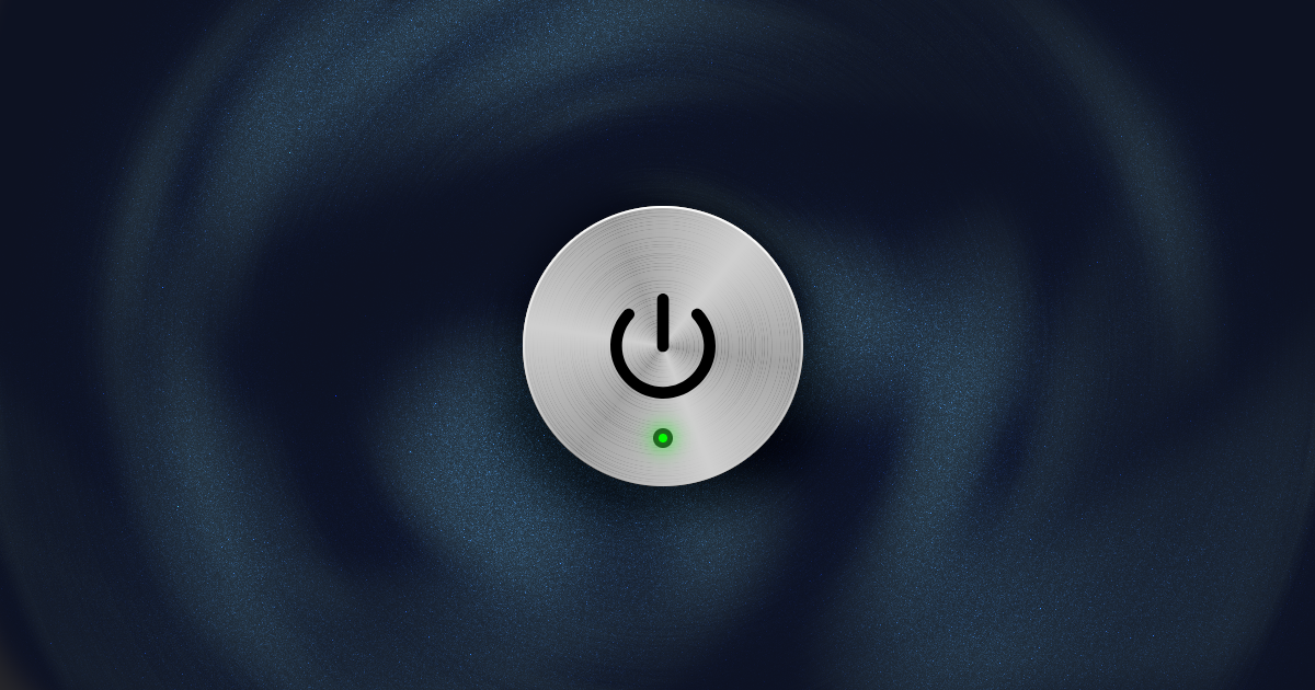
Brushed Metal UI in Jetpack Compose
How to create this skeuomorphic metallic effect using gradients

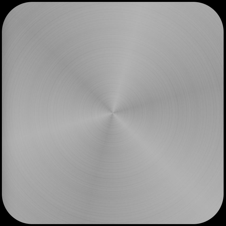
During the heights of popularity of skeuomorphic design, this brushed metal finish was one of the go-to textures for UI elements.
Let's learn how to recreate and animate this effect in Jetpack Compose.
As with many effects, this will be achieved by layering different elements that will add up to the desired look. Let's examine layer by layer, how each of them work
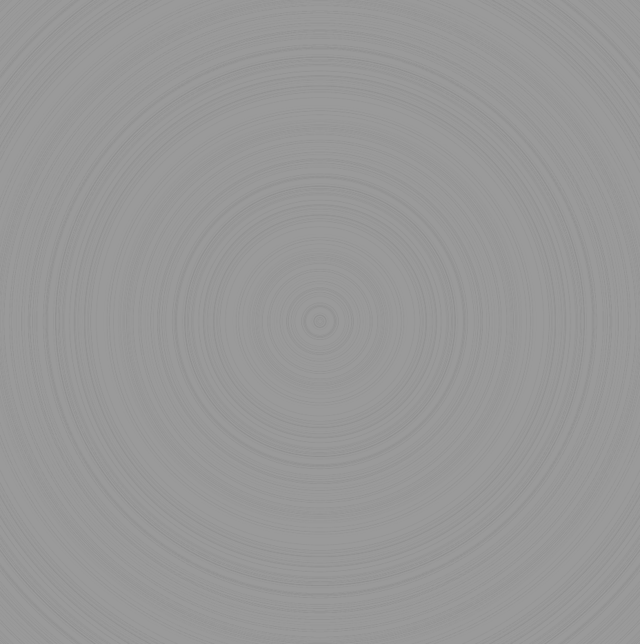
Rings
First, let's create the circular ridges. To do this, we will use a radial gradient with a repeated pattern. The colors for this gradient (and for the next section), will be derived from a base color.
val baseColor: Color = Color(0xFF9A9A9A)
For this, we have chosen a light gray. Using this baseColor we can calculate a darker version that will be the color of our rings.
val ringAlpha = .4f
val ringColor = lerp(baseColor, Color.Black, .5f)
.copy(alpha = ringAlpha)
This is done by mixing the base color with black, and then reducing its opacity. If you would like to tweak the base color, remember to also tweak the ringAlpha. Generally, you will need a lower opacity for lighter colors, and vice-versa.
Now, using ringColor, let's generate a list of randomly spaced colors.
val ringColors: List<Color> = buildList {
	val ringCount = 40
    (0..ringCount).forEach {
        (0..Random.nextInt(2, 19)).forEach { add(Color.Transparent) }
        (0..Random.nextInt(0, 3)).forEach { add(ringColor) }
    }
}
We do this by simply adding a random number of Color.Transparent followed by a random number of ringColor.
Finally, using our canvas functions, we can draw the gradient.
drawRect(color = baseColor)
drawRect(
    brush = Brush.radialGradient(
        colors = ringColors,
        tileMode = TileMode.Repeated,
    ),
    blendMode = BlendMode.Overlay,
)
First, we draw the baseColor to act as a …base. Then we draw our transparent rings on top of that using our ringColors. For this, I found BlendMode.Overlay as the best for blending with various base colors, but feel free to experiment with other blend modes for a different effect.
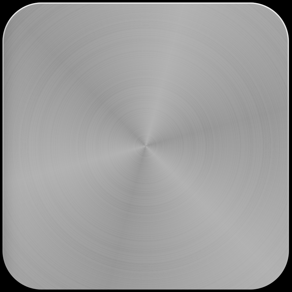
Highlights
On top of the rings, we will also render some highlights that mimics the light hitting the metal. We will also be able to rotate this for it to look like the light source is moving.
For this effect, we will use a sweep gradient (also called conic or angular).
Like before, let's start by deriving the color needed from baseColor.
val highlightAlpha = .5f
val highlightColor = lerp(baseColor, Color.White, .5f)
.copy(alpha = highlightAlpha)
Unlike before, we will calculate the highlightColor by mixing it with white, instead of black.
The alpha for this new color can be tweaked as well, depending on the base color.
val highlightColors: List<Color> = buildList {
	val highlightCount = 3
    add(highlightColor)
    repeat(highlightCount) {
        add(highlightColor.copy(alpha = 0f))
        if (it < highlightCount - 1) add(highlightColor)
    }
    add(highlightColor)
}
Then, we need to create the list of colors that we will feed into the sweep gradient. We will start and end with the same color, so that our sweep gradient is continuous. In between, we can add as many highlight "spokes", according to highlightCount.
drawRect(
    brush = Brush.sweepGradient(
        colors = highlightColors,
    ),
)
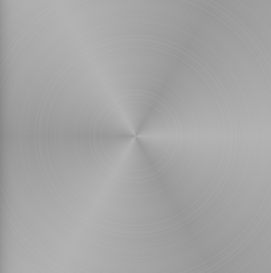
Rendering it as a rectangle is okay for a static highlight, but as mentioned before, we would like to rotate the highlight. The rotation can be made to be reactive to device orientation or any relevant user event.
But first, let's see how we would just rotate it by 45º.
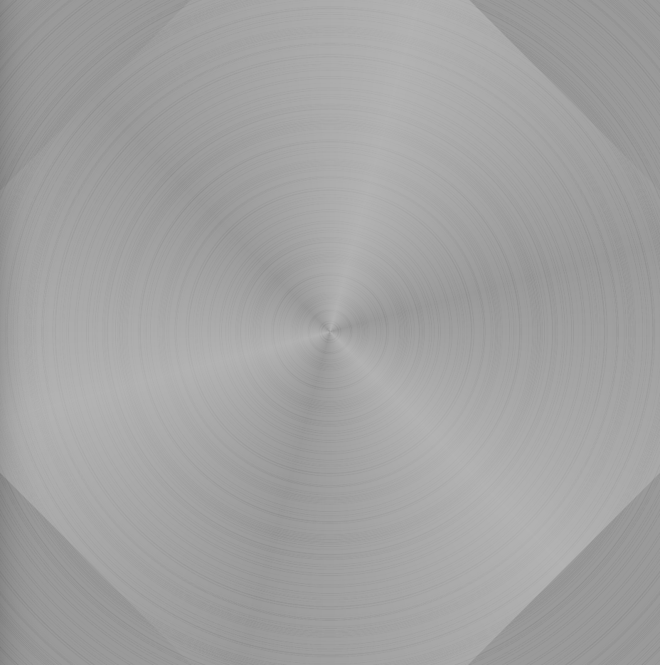
In the image above, we see that rotating the gradient by any angle will cause some unsightly clipping. Let’s see how to fix this so that we can still rotate this layer.
val highlightRotation = 45f
rotate(
    degrees = highlightRotation,
) {
    drawCircle(
        brush = Brush.sweepGradient(
            colors = highlightColors,
        ),
        radius = size.width * size.height
    )
}
A couple of things have changed here. Most importantly, we are now drawing the sweep gradient as a circle, and giving it a radius that is much bigger than the bounds of our view. This is to ensure that the gradient always fills up the area, despite its rotation.
Then the entire draw call is wrapped by a rotate function, which just rotates any canvas elements within it by a particular degree amount.
Now, we have a large circle that extends far beyond the bounds of the view. This needs to be clipped.
val shape = RoundedCornerShape(64.dp)
val path = Path().apply {
	addOutline(
		shape.createOutline(size, layoutDirection, Density(density))
	)
}

clipPath(path) {
	// All draw..() calls here
}
To clip this, we define any shape (RoundedCornerShape, CircleShape, RectangleShape, etc.) and create a path from it. Then we use this path in a clipPath function to clip all the draw calls we have done thus far.
Extras
At this point, we have the basic texture down. From here, you need to think through what you are trying to mimic with this texture. Do you want it to be extra glossy? Do you want it to shimmer according to accelerometer?
Here is where you can add informed details that will really elevate your design.
One detail you would most likely need, is a chamfered edge, which can be imitated using a border modifier.
.border(
    width = 2.dp,
    shape = RoundedCornerShape(64.dp),
    brush = Brush.verticalGradient(
        colors = listOf(
            Color.White.copy(alpha = .8f),
            Color.White.copy(alpha = 0f),
        )
    )
)
For this, I use a vertical gradient and put a very light color at the top. You would need to evaluate where your imaginary light source is originating and align the gradient accordingly.
For simplicity, I usually imagine the app is being illuminated from the top. But I can imagine unique user interfaces where a certain view can be perceived as a light source.
Conclusion
Anyways, that's been how to create a faux metal texture in Jetpack Compose.
If you would like the ready-to-use modifier, along with a simple implementation, you can find it in this UI recipe.
 sinasamaki
Thanks for reading and good luck!
Subscribe for UI recipes