Custom Sliders in Jetpack Compose
Create unique and delightful sliders for your app

A slider is a UI element that enables the user to select a value within a specified range. The Material 3 documentation and its library provide guidance on implementing them. But by default, you will get the same slider as every other app with Material Design.
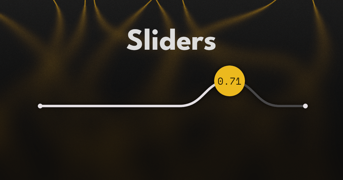
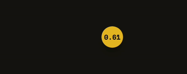
What if you want something a little more exciting like this?

Luckily, the Material 3 library for Jetpack Compose can be easily extended to customize sliders however we want.
Basics
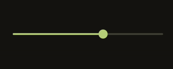
First, let's implement a simple custom design for a slider using the Material 3 library.
var value by remember { mutableFloatStateOf(.5f) }

Slider(
	value = value,
	onValueChange = { value = it },
)
This code, will give us a functioning default slider that will inherit all the Material 3 colors defined.
Slider takes in two other optional arguments that we can implement to make it look however we want. These are thumb and track and they can take in any Composables and render them in their respective positions.
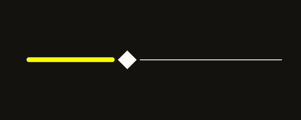
For example, we can replace the circular thumb of the slider with a diamond shape, like this:
Slider(
    value = value,
    onValueChange = { value = it },
    thumb = {
        Box(
            Modifier
                .size(48.dp)
                .padding(4.dp)
                .background(Color.White, CutCornerShape(20.dp))
        )
    },
    ...
)
And then, we can modify the track like this:
Slider(
    ...

    track = { sliderState ->

		// Calculate fraction of the slider that is active
        val fraction by remember {
            derivedStateOf {
                (sliderState.value - sliderState.valueRange.start) / (sliderState.valueRange.endInclusive - sliderState.valueRange.start)
            }
        }

        Box(Modifier.fillMaxWidth()) {
		    Box(
		        Modifier
		            .fillMaxWidth(fraction)
		            .align(Alignment.CenterStart)
		            .height(6.dp)
		            .padding(end = 16.dp)
		            .background(Color.Yellow, CircleShape)
		    )
		    Box(
		        Modifier
		            .fillMaxWidth(1f - fraction)
		            .align(Alignment.CenterEnd)
		            .height(1.dp)
		            .padding(start = 16.dp)
		            .background(Color.White, CircleShape)
		    )
		}
    }
)
For the track, we first need the fraction amount of the slider that is active. We could use the value variable that we made earlier, but this would fail in a more complex slider with a custom range (not 0f..1f).
Therefore we need to take into account the start and end ranges of the slider, in order to calculate an accurate fraction for all situations.
Next, we can use this fraction in whatever UI elements we choose to display this information. Here, I am simply using two boxes that I have supplied fraction in both their fillMaxWidth modifiers. The first Box, is thicker and yellow, while the second is thinner and white. These are to represent the active and inactive sections respectively.
Now that we have covered the basics, let's move on to a more complex example.
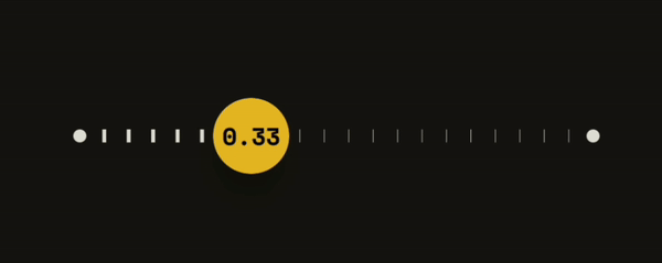
Line Slider
Setup
Let's create a Composable that will hold our LineSlider for easier reusability.
@OptIn(ExperimentalMaterial3Api::class)
@Composable
fun LineSlider(
    value: Float,
    onValueChange: (Float) -> Unit,
    modifier: Modifier = Modifier,
    steps: Int = 0,
    valueRange: ClosedFloatingPointRange<Float> = 0f..1f,
    thumbDisplay: (Float) -> String = { "" },
) {
	// Implementation goes here
}
The first two, value and onValueChange, we have seen earlier. They are not optional since they are integral to a working Slider.
After the Modifier, we have steps which defines the amount of snapping points along the slider. 0 gives as a smooth slider with no snapping. We will use this value later on to render some graduations along our slider.
valueRange changes the range of values the user can use the slider to select.
The parameters explained above will be passed in to the Material 3 Slider later on. But the thumbDisplay will be used by us to render text on the slider thumb. We are passing it in as a function of the current value so that the caller of LineSlider can format the text to their liking.
Now let's create our slider.
val animatedValue by animateFloatAsState(
    targetValue = value,
    animationSpec = spring(
        dampingRatio = Spring.DampingRatioLowBouncy
    ), label = "animatedValue"
)

Slider(
    value = animatedValue,
    onValueChange = onValueChange,
    modifier = modifier,
    valueRange = valueRange,
    steps = steps,
)
We pass in all the parameters as arguments, except value. For this, we create an animation using animateFloatAsState(). This will give us a smooth animation when the user taps the slider, or starts sliding from a point that is not close to the current slider position.
In fact, if you run it now, you can see that the default slider will have an animation on the thumb, as you tap from point to point.
Thumb
For the thumb, we want a circle that raises to a certain height when the user is dragging the slider, and then back down when the user releases it. Inside the circle, we shall render the text defined by thumbDisplay.
...

val interaction = remember { MutableInteractionSource() }
val isDragging by interaction.collectIsDraggedAsState()
val density = LocalDensity.current
val offsetHeight by animateFloatAsState(
    targetValue = with(density) { if (isDragging) 36.dp.toPx() else 0.dp.toPx() },
    animationSpec = spring(
        stiffness = Spring.StiffnessMediumLow,
        dampingRatio = Spring.DampingRatioLowBouncy
    ), label = "offsetAnimation"
)

Slider(
    ...
    interactionSource = interaction,
)
To know when a user is dragging the slider, we need to create a MutableInteractionSource and pass that into the Slider. We can then use it to collect the boolean state indicating if the user is dragging the slider.
We can finally use isDragging to animate a float value to a certain height. This offsetHeight value is what we shall use for raising the thumb.
Ahh, the thumb. We need to talk about that.
Earlier, I said that we pass in the thumb as Composable function to the Slider. But that's not exactly what I did for this example. The Material 3 slider takes whatever is in the thumb parameter and positions it according to the position of the slider. Unfortunately, this positioning discards the horizontal animation, that we created in the last section, when steps is more than 0.
This may not be a problem with other slider designs. But for ours, we will, in a later section, add a curved line that animates smoothly. Our slider will then look too janky if our thumb is jittering around out of place.
Because of this, we shall pass in an empty lambda for thumb.
Slider(
    ...
    thumb = {},
)
The thumb code, shall go into track
Slider(
    ...
    track = { sliderState ->

        val fraction by remember {
            derivedStateOf {
                (animatedValue - sliderState.valueRange.start) / (sliderState.valueRange.endInclusive - sliderState.valueRange.start)
            }
        }

        ...
    }
)
Inside track we first calculate the fraction of the slider that is active.
track = { sliderState ->
	var width by remember { mutableIntStateOf(0) }

	Box(
	    Modifier
	        .clearAndSetSemantics { }
	        .height(thumbSize)
	        .fillMaxWidth()
	        .onSizeChanged { width = it.width },
	) {
		// Thumb and track UI code will go here
	}
}
Next, we will create a Box that fills the entire space and we grab the width in pixels. Remember that we lost the convenience of the Slider automatically calculating the position of the thumb. So we need to do it ourselves using the full width.
clearAndSetSemantics { }is used to cancel out any screen reader from highlighting this section. Without this, any user with Talkbalk enabled could select the text inside the thumb. Instead, let's let theSliderhandle the accessibility.
Box(
    Modifier
        .zIndex(10f)
        .align(Alignment.CenterStart)
        .offset {
            IntOffset(
                x = lerp(
                    start = -(thumbSize / 2).toPx(),
                    end = width - (thumbSize / 2).toPx(),
                    t = fraction
                ).roundToInt(),
                y = -offsetHeight.roundToInt(),
            )
        }
        ...
Here we are defining the positioning of the thumb. We want it above other elements so we give it a high zIndex. Then we align it to CenterStart.
Now it's time to use the width and the fraction. Based on fraction, we will offset the Box on the x-axis.
On the y-axis, we will use the offsetHeight from earlier, which will raise or lower the thumb if the user is dragging it.
Box(
    Modifier
        ...
        .size(thumbSize)
        .padding(10.dp)
        .shadow(
            elevation = 10.dp,
            shape = CircleShape,
        )
        .background(
            color = Color(0xFFECB91F),
            shape = CircleShape
        ),
    contentAlignment = Alignment.Center,
) {
    Text(
        thumbDisplay(animatedValue),
        style = MaterialTheme.typography.labelSmall,
        color = Color.Black
    )
}
Finally, we define the appearance of the thumb itself. We'll give it a circular shape with a yellow color.
Inside it, we will render the text.
Track
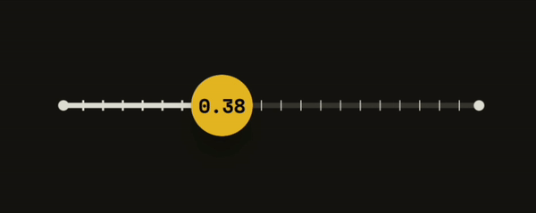
Our track will be a line that runs from end to end of the slider. But when the user drags on the slider, The line transforms into a curve, with the topmost point on the position of the raised thumb. If steps is more than 0, there will be some graduations along the track.
Right underneath the thumb, we will add the code for our track.
val strokeColor = MaterialTheme.colorScheme.onSurface
val isLtr = LocalLayoutDirection.current == LayoutDirection.Ltr
Box(
    Modifier
        .align(Alignment.Center)
        .fillMaxWidth()
        .drawWithCache {
            onDrawBehind {
                scale(
                    scaleY = 1f,
                    scaleX = if (isLtr) 1f else -1f
                ) {
                    drawSliderPath(
                        fraction = fraction,
                        offsetHeight = offsetHeight,
                        color = strokeColor,
                        steps = sliderState.steps
                    )
                }
            }
        }
)
In this code, we are collecting the necessary arguments to pass into drawSliderPath(), which will draw our track.
But before we draw it, we will flip it using scale() if isLtr is false. This is to account for right-to-left languages, where the slider would be running from right to left instead.
The Material 3 slider handles RTL well, but because we are doing some custom drawing for the track, we would need to take care of it ourselves here.
On to the definition of drawSliderPath().
fun DrawScope.drawSliderPath(
    fraction: Float,
    offsetHeight: Float,
    color: Color,
    steps: Int,
) {
	val path = Path()
	val activeWidth = size.width * fraction
	val midPointHeight = size.height / 2
	val curveHeight = midPointHeight - offsetHeight
	val beyondBounds = size.width * 2
	val ramp = 72.dp.toPx()

	...

}
After creating the path, we will set up some useful measurements that we will use.
// Point far beyond the right edge
path.moveTo(
    x = beyondBounds,
    y = midPointHeight
)

// Line to the "base" right before the curve
path.lineTo(
    x = activeWidth + ramp,
    y = midPointHeight
)

// Smooth curve to the top of the curve
path.cubicTo(
    x1 = activeWidth + (ramp / 2),
    y1 = midPointHeight,
    x2 = activeWidth + (ramp / 2),
    y2 = curveHeight,
    x3 = activeWidth,
    y3 = curveHeight,
)

// Smooth curve down the curve to the "base" on the other side
path.cubicTo(
    x1 = activeWidth - (ramp / 2),
    y1 = curveHeight,
    x2 = activeWidth - (ramp / 2),
    y2 = midPointHeight,
    x3 = activeWidth - ramp,
    y3 = midPointHeight
)

// Line to a point far beyond the left edge
path.lineTo(
    x = -beyondBounds,
    y = midPointHeight
)
Here, we have defined the path of the track, from right to left. The path is running to and from points that are beyond the bounds of our track. Later, we will trim it and get a nice curve when the user drags towards the edges of the track.
Unfortunately, the PathOperation that we will use for trimming the path does not work as intended with an open path. And if we close our path now, we will lose our thin curved line and instead have a boa constrictor digesting an elephant.
Therefore we need to close the path manually along itself.
val variation = .1f

// Line to a point far beyond the left edge
path.lineTo(
    x = -beyondBounds,
    y = midPointHeight + variation
)

// Line to the "base" right before the curve
path.lineTo(
    x = activeWidth - ramp,
    y = midPointHeight + variation
)

// Smooth curve to the top of the curve
path.cubicTo(
    x1 = activeWidth - (ramp / 2),
    y1 = midPointHeight + variation,
    x2 = activeWidth - (ramp / 2),
    y2 = curveHeight + variation,
    x3 = activeWidth,
    y3 = curveHeight + variation,
)

// Smooth curve down the curve to the "base" on the other side
path.cubicTo(
    x1 = activeWidth + (ramp / 2),
    y1 = curveHeight + variation,
    x2 = activeWidth + (ramp / 2),
    y2 = midPointHeight + variation,
    x3 = activeWidth + ramp,
    y3 = midPointHeight + variation,
)

// Line to a point far beyond the right edge
path.lineTo(
    x = beyondBounds,
    y = midPointHeight + variation
)
Here is the same line, but in reverse, plus some variation on the y-axis.
This was the best solution I could come up with. But I don't love it. I am open to any ideas down in the comments on how to improve this.
Next, let's trim the path.
val exclude = Path().apply {
    addRect(Rect(-beyondBounds, -beyondBounds, 0f, beyondBounds))
    addRect(Rect(size.width, -beyondBounds, beyondBounds, beyondBounds))
}

val trimmedPath = Path()
trimmedPath.op(path, exclude, PathOperation.Difference)
We first define the path to exclude, which is any point on the left or right, beyond the bounds of the UI element. Using this exclude path, we can then create a new path that is trimmed using PathOperation.Difference.
Before drawing the track, we'll draw the graduations along the path.
val pathMeasure = PathMeasure()
pathMeasure.setPath(trimmedPath, false)

val graduations = steps + 1
for (i in 0..graduations) {
    val pos = pathMeasure.getPosition(
	    (i / graduations.toFloat()) * pathMeasure.length / 2
    )
    val height = 10f
    when (i) {
        0, graduations -> drawCircle(
            color = color,
            radius = 10f,
            center = pos
        )

        else -> drawLine(
            strokeWidth = if (pos.x < activeWidth) 4f else 2f,
            color = color,
            start = pos + Offset(0f, height),
            end = pos + Offset(0f, -height),
        )
    }
}
In order to draw them, we will need to know the length of our path to space out the graduations evenly. The number of graduations will be one more than steps to ensure that we always have a point at the start and end of the track.
Then we calculate position on the path of each graduation based on half the length (Remember, we have double the path).
With this position, we can draw a circle on the ends, and a lines along the track. Since the position also has the y-position of the path. Whatever we draw will also move up and down with the curve.
And finally we draw the track itself.
fun DrawScope.drawSliderPath(...) {
	...
	clipRect(
	    left = -beyondBounds,
	    top = -beyondBounds,
	    bottom = beyondBounds,
	    right = activeWidth,
	) {
	    drawTrimmedPath(trimmedPath, color)
	}
	clipRect(
	    left = activeWidth,
	    top = -beyondBounds,
	    bottom = beyondBounds,
	    right = beyondBounds,
	) {
	    drawTrimmedPath(trimmedPath, color.copy(alpha = .2f))
	}
}

fun DrawScope.drawTrimmedPath(path: Path, color: Color) {
    drawPath(
        path = path,
        color = color,
        style = Stroke(
            width = 10f,
            cap = StrokeCap.Round,
            join = StrokeJoin.Round,
        ),
    )
}
We draw it twice (active & inactive) and clip it according to activeWidth. The active side will have the color provided but the inactive side will have the same color at 20% opacity.
And with that, we have our unique slider, ready to use in your app. Feel free to play around with the code to come up with some whacky variations. If you have any questions or comments, don't hesitate to write them below. Source code is available here.
Thanks for reading and good luck!
Subscribe for UI recipes