How I prototype with colors in Jetpack Compose
Don't waste time choosing colors in Jetpack Compose

In this quick article, I will go over how I manage and develop with colors as I prototype new UI designs. This will be geared towards a developer who is making something quickly with no brand guidelines or pre-made designs.
In these creative moments, it is best to prioritize quick iteration, so let's go over some tactics to achieve this.
Stealing a Predefined Color Palette
This is, in my opinion, the most important tip that has optimized my color picking process.
While adding color to a design, I often feel like the MaterialTheme colors are restrictive and end up fiddling with color hex values.
This becomes a time suck, whether I am copy/pasting hex codes, or fighting with Android Studio's buggy color picker.
In comparison, I have an easier time in web development projects, where I am using tailwindcss. Here, tailwind provides a premade palette of 22 groups of colors, each group with 11 variants.
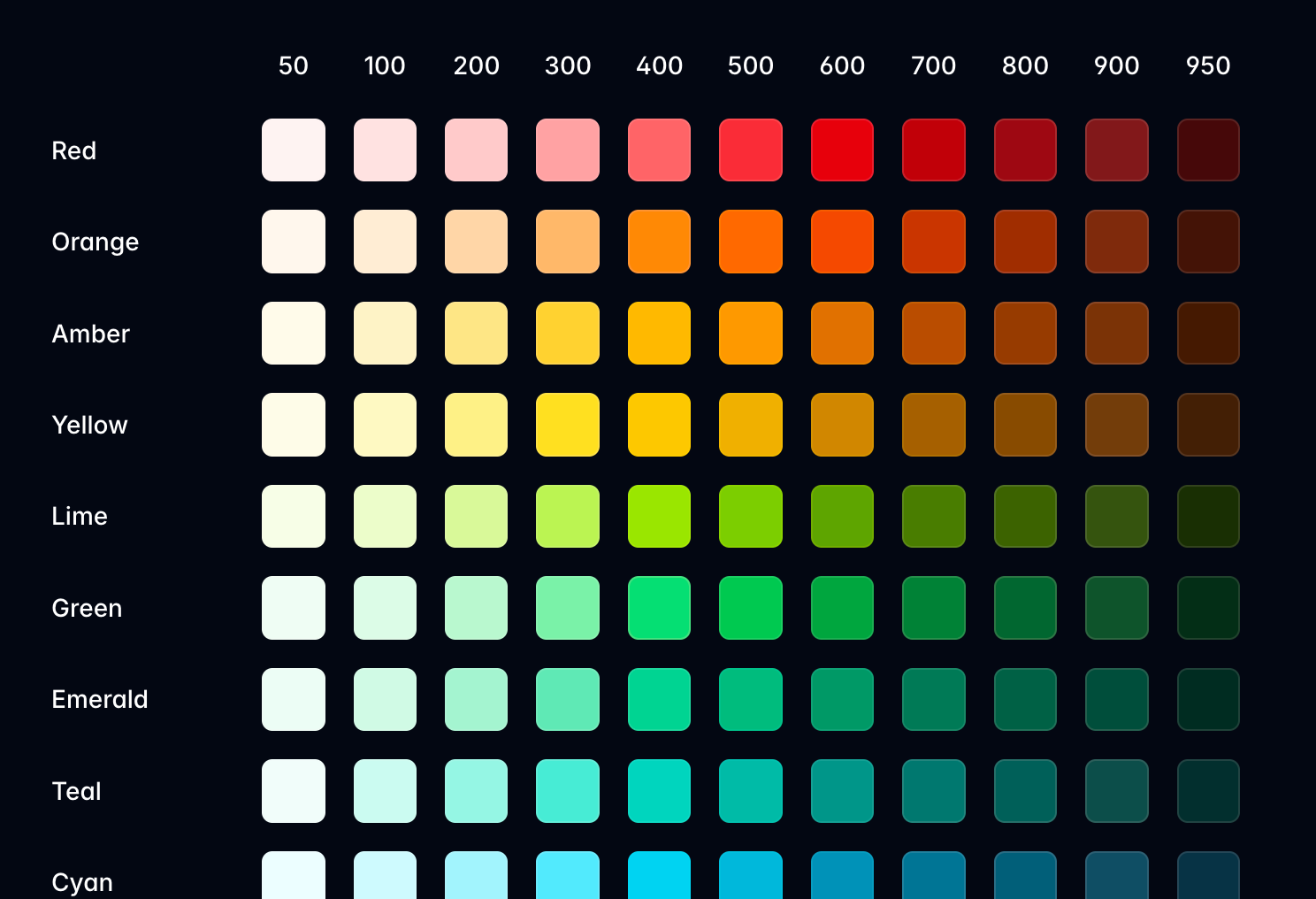
The groups are identified by the color name (red, orange, pink, slate, etc.) and the variants are identified by a number (50, 100, 200, ... 800, 900, 950).
The variant number determines how light or dark the color should be. 50 being the lightest and 950 the darkest.
As a result, picking colors in tailwind is as easy as picking a color and a number. Simple enough for us non-designers ;)
<div class="bg-yellow-900">
	<h1 class="text-red-200">We live in a twilight world</h1>
</div>
Okay, enough HTML for today. How do we apply this in Jetpack Compose?
Let's just take all the hex values and add them in a Kotlin file as Color objects. We can also give them variable names like their web counterparts. So red-200 becomes Red200.
I have already done this in an earlier project, so feel free to copy from here.
With these new color values, we can write the earlier code sample in Compose like:
Box(modifier = Modifier
	.background(color = Yellow900)
) {
	Text(
		text = "We live in a twilight world",
		color = Red200,
	)
}
With this one file copied over to any project, I have been able to cut down a lot of time wasted on choosing colors that I am happy with.
Turns out I just need 242 colors, and not the entire RGB spectrum!
Dark Light Color Chooser
When going on this route of custom colors, we often forget to support light mode (or forget dark mode for the day-walkers ☀️)
So for prototyping, I have a quick hack that makes it easy to specify dark and light colors.
@ReadOnlyComposable
@Composable
infix fun Color.or(light: Color) =
    if (isSystemInDarkTheme()) this else light
This infix extension function simply checks the current system theming settings and applies the dark or light variant color to their respective mode.
If you are using a theme picker local to your app, you should swap isSystemInDarkTheme() with that boolean value.I can then use this function in the prior code to quickly specify a light variant of a color like this:
Box(modifier = Modifier
	.background(color = Yellow900 or Blue200)
) {
	Text(
		text = "We live in a twilight world",
		color = Red200 or Orange700,
	)
}
Hopefully with a little bit of syntactic sugar, we can make it easier to think of both themes from the beginning.
Previewing Colors
Finally, when it comes to seeing what our color changes result to, a 10 second, or longer ;( build is simply out of the question. For quick iteration with our design, we need to see changes much quicker.
In an Android project, previews come to the rescue, with usually 2-3 seconds before seeing changes made. These have come a long way in terms of stability, and have saved me a lot of time when tweaking color values in a UI design.
With previews, you could make designs for elements inside your app. Or you can even go further and create a view that is only for previews, but incorporates different theming possibilities with your colors.
This might look like a brand board where different colors are applied on shapes, text and icons.
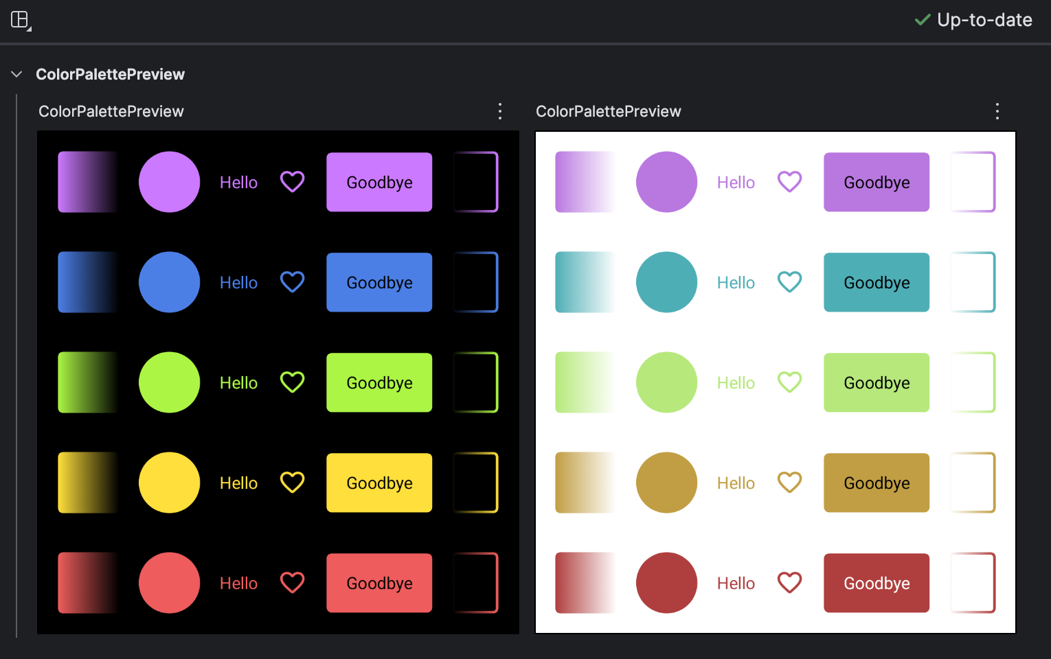
With everything at a glance, you can easily notice how a color change works for an icon, but not text.
As earlier stated, this works well in an Android project. But when working in Compose Multiplatform, the story is a little different. Previews for multiplatform are in development, but I haven't been able to use them reliably. And using an Android target for previews is quite cumbersome.
However, where multiplatform fails (for now) in previews, it gains a total beast in hot reload. This process deserves an article to itself, but for now, it's been a useful tool in previewing colors, and much more.
Let me know below your favorite hack on using colors.
Thanks for reading and good luck!
Subscribe for UI recipes