Loading images using coil in Jetpack Compose
Ultimate guide to load network images in Jetpack Compose using coil library
Loading images, especially over a network, can be a daunting process. One has to deal with various formats, slow connections, caching for later use, etc.
Luckily there are 3rd party libraries designed to take on the heavy lifting for us.
My library of choice for this task is the coil image loading library, developed by Instacart. Apart from being fast and lightweight, it works well with Jetpack Compose and uses coroutines, pairing very well with my android dev workflow.
In this article, we will look into how to integrate the coil library into Jetpack Compose.
Before we begin
We will need to add the coil compose library to our project. Add the following line to the dependencies in your app build.gradle file.
implementation("io.coil-kt:coil-compose:2.2.2")
Don't forget to also add the internet permission inside the AndroidManifest.xml
<manifest
	...
    <uses-permission android:name="android.permission.INTERNET" />
The basics
To load an image using coil, we just need AsyncImage
AsyncImage(
    model = "https://example.com/image.jpg",
    contentDescription = "This is an example image"
)
It's that easy!
With this code, coil handles loading the image over a network, displaying it and automatically caching it for later use. It may look simple now but the AsyncImage composable offers extended functionality.
Async Image customization
Let's go some of the parameters it has to offer.
1. model
The model parameter takes in an object of type Any and can process various inputs. In this case, I passed in a url of an image but it can also detect android resources(drawables and vector drawables), files, byte arrays, etc.
The model parameter can also take in an ImageRequest object. This provides us with much more functionality than just passing in just a url.
ImageRequest
Here is how to use the ImageRequest. We replace the url string with a builder.
AsyncImage(
    model = ImageRequest.Builder(LocalContext.current)
        .data("https://example.com/image.jpg")
        .build(),
    contentDescription = "ImageRequest example",
)
This may look like more unnecessary code at first but it can give us more control over how we load our images. Frankly, there are many options with the Image request builder that I am not familiar with. The options that I have found very useful are cache keys and cache policies.
Cache keys allow us to set a key for the cache location of the image, like this:
...
.diskCacheKey("halloween_image_$date_$index")
.build()
This is useful for identifying images in the cache. For example, we may have halloween images in the cache that are no longer needed at the moment. Since we saved them with halloween in the key, we can delete all images in cache with that key. You can also set the memoryCacheKey.
Cache policies are used to activate/deactivate image sources, like this:
.networkCachePolicy(CachePolicy.ENABLED)
.diskCachePolicy(CachePolicy.DISABLED)
.memoryCachePolicy(CachePolicy.ENABLED)
These useful when you want to restrict read/write access to a certain cache for a particular image. CachePolicy.ENABLED and CachePolicy.DISABLED either allow or deny full read/write access respectively, but we can also restrict them separately with CachePolicy.READ_ONLY and CachePolicy.WRITE_ONLY.
For all the other possibilities available to us through ImageRequest, check out the source code.
2. contentDescription
The content description simply describes the content in the image displayed. This is similar to the alt tags for images on websites and it is invaluable for accessibility purposes so try to include it wherever necessary.
contentDescription = "a description of the image for accessibility",
In cases where it is not necessary (eg. a parent view handles the accessibility) set this to null.
3. placeholder & error
These two parameters define a backup image that is used when the network image is either loading or has failed, respectively. Usually it makes sense that these are local images in your resources folder.
placeholder = painterResource(id = R.drawable.loading_placeholder),
error = painterResource(id = R.drawable.image_error),
4. contentScale
This defines how the source image fits in your destination based on how you want the content displayed. For example, we may want a code sample screenshot to display its contents from edge to edge, but a portrait can be cropped in to the subject in the center.
contentScale = ContentScale.Crop,

5. alignment
Alignment goes hand in hand with the contentScale. By default, the contentScale will crop to the center. Using this, we can crop to all 9 Alignment anchors.
alignment = Alignment.BottomStart,
Beyond this, we can create our own custom Alignment anchor so that we can focus on specific parts of an image.
6. filterQuality
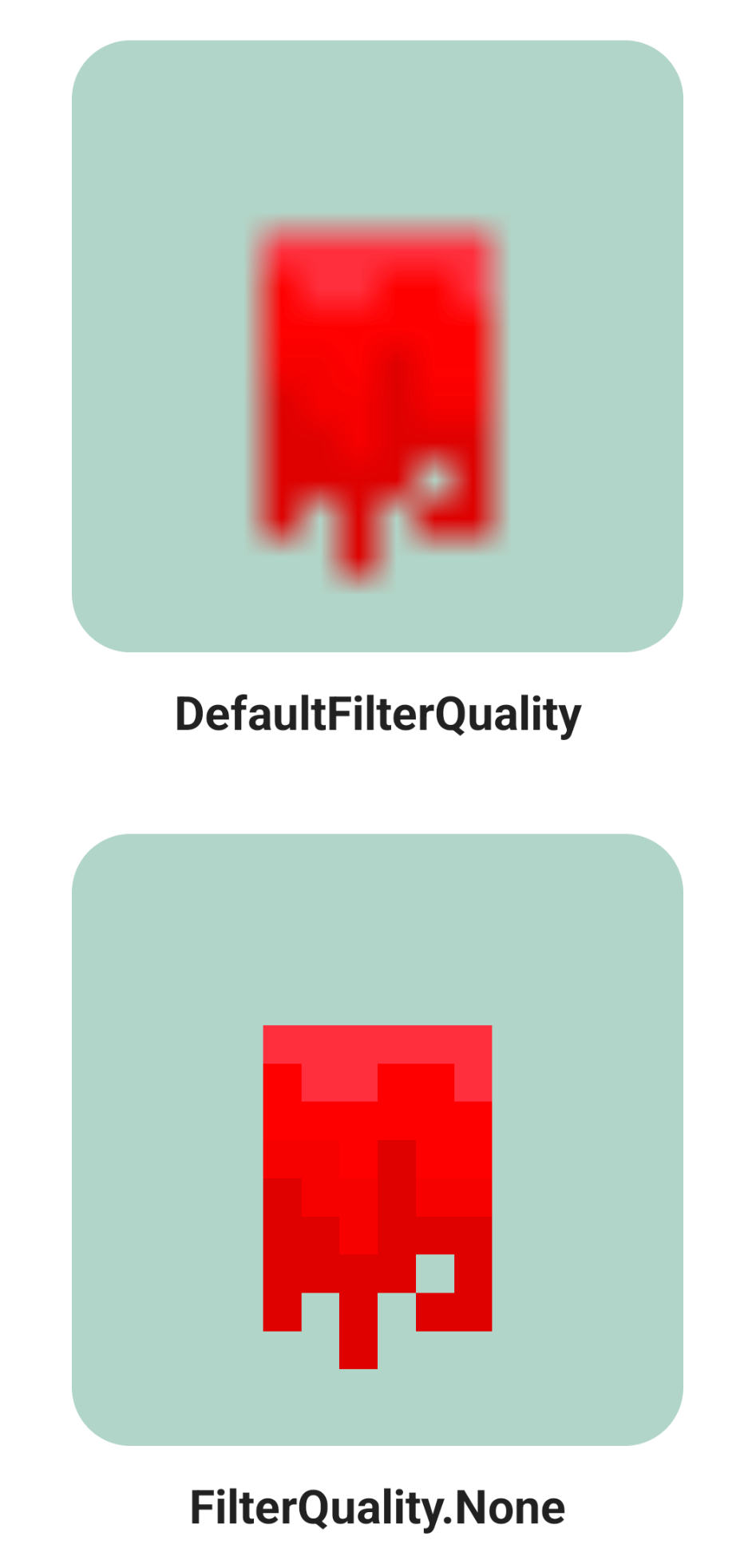
This defines the sampling algorithm used to scale a bitmap for display. It could be used when you need a higher quality image. But I use it the other way by turning the filter quality all the way down to display pixel art.
filterQuality = FilterQuality.None
With this way, I can display a 16x16 image and it will appear crispy.

Animations
Coil offers a basic crossfade animation that we can enable using the ImageRequest builder.
AsyncImage(
    model = ImageRequest.Builder(LocalContext.current)
        .data("https://example.com/image.jpg")
        .crossfade(true)
        .build(),
    contentDescription = "default crossfade example"
)

This is quick and simple and can be used when you just need a crossfade for when the image is loading. Unfortunately, coil does not offer any more advanced animations.
For that, we need to turn away from the AsyncImage and use the rememberAsyncImagePainter function instead.
Similar to the AsyncImage we pass in a model that can be a url, ImageRequest, etc. But instead of returning an image ready to display, it returns a state that we can use to display our image.
val painter = rememberAsyncImagePainter("https://example.com/image.jpg")

Image(
    painter = painter,
    contentDescription = "example using async image painter"
)
This example just displays the image, but we can use the state returned to us to react to image loading state and animate accordingly. Here is an example that imitates the default crossfade.
val painter = rememberAsyncImagePainter("https://example.com/image.jpg")
val state = painter.state

val transition by animateFloatAsState(
    targetValue = if (state is AsyncImagePainter.State.Success) 1f else 0f
)
Image(
    painter = painter,
    contentDescription = "custom transition based on painter state",
    modifier = Modifier
        .alpha(transition)
)
But we can now do better than just a simple fade!
.saturation(transition)
.scale(.8f + (.2f * transition))
.graphicsLayer { rotationX = (1f - transition) * 5f }
.alpha(min(1f, transition / .2f))
In this custom animation, I am also animating the saturation, scale and rotation using the same transition variable from the previous code sample. I have also shortened the alpha animation so that the other animations are more visible.
One last thing we can do with the state is add a fancy loading animation, in place of the static placeholder drawable that I mentioned in the previous section.
if (state is AsyncImagePainter.State.Loading) {
    LoadingAnimation()
}
With all this, we get this sweet animation!

Thanks for reading and good luck!
Subscribe for UI recipes
