
Creating Pager Animations in Jetpack Compose
How to create 3 unique Pager animations.
In part one of this series, we learned how to set up a Pager in Compose and how to control it.
Now, we shall make animated transitions while moving between pages.
Animations of this type can make your ui exciting and bring delight to the user. In the end, I will walk you through 3 unique pager animations.
Calculating Page Offset
Inside our PagerState, there is a float provided as a state called currentPageOffsetFraction and this is the key to all our animations. As the name suggests, this provides us with the offset of the current page. This value goes from -0.5 to 0.5.
-0.5== current page is 50% to the right of the the left edge0.0== current page is settled along the left edge0.5== current page is 50% to the left of the left edge
This value can be best displayed with the animation below. I am printing the currentPageOffset and the currentPage so you can see how the values change as we swipe across a page
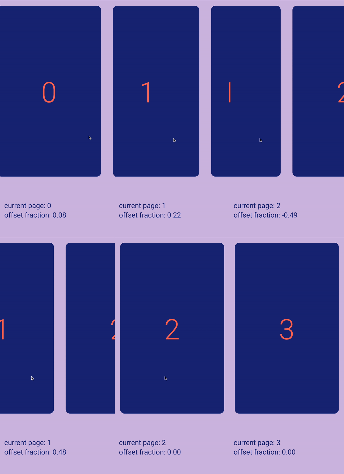
This is good, but we need an individual offset for every page and we also need to calculate a page's offset after it is off-screen by more than 50%.
Using the currentPageOffset and the currentPage we can calculate the offset for any page in our Pager. In the next animation, we print out the current offset of all the pages. Note how the values change as we scroll. Before, we only had a range of -0.5 to 0.5. And now we have individual offset for each page.
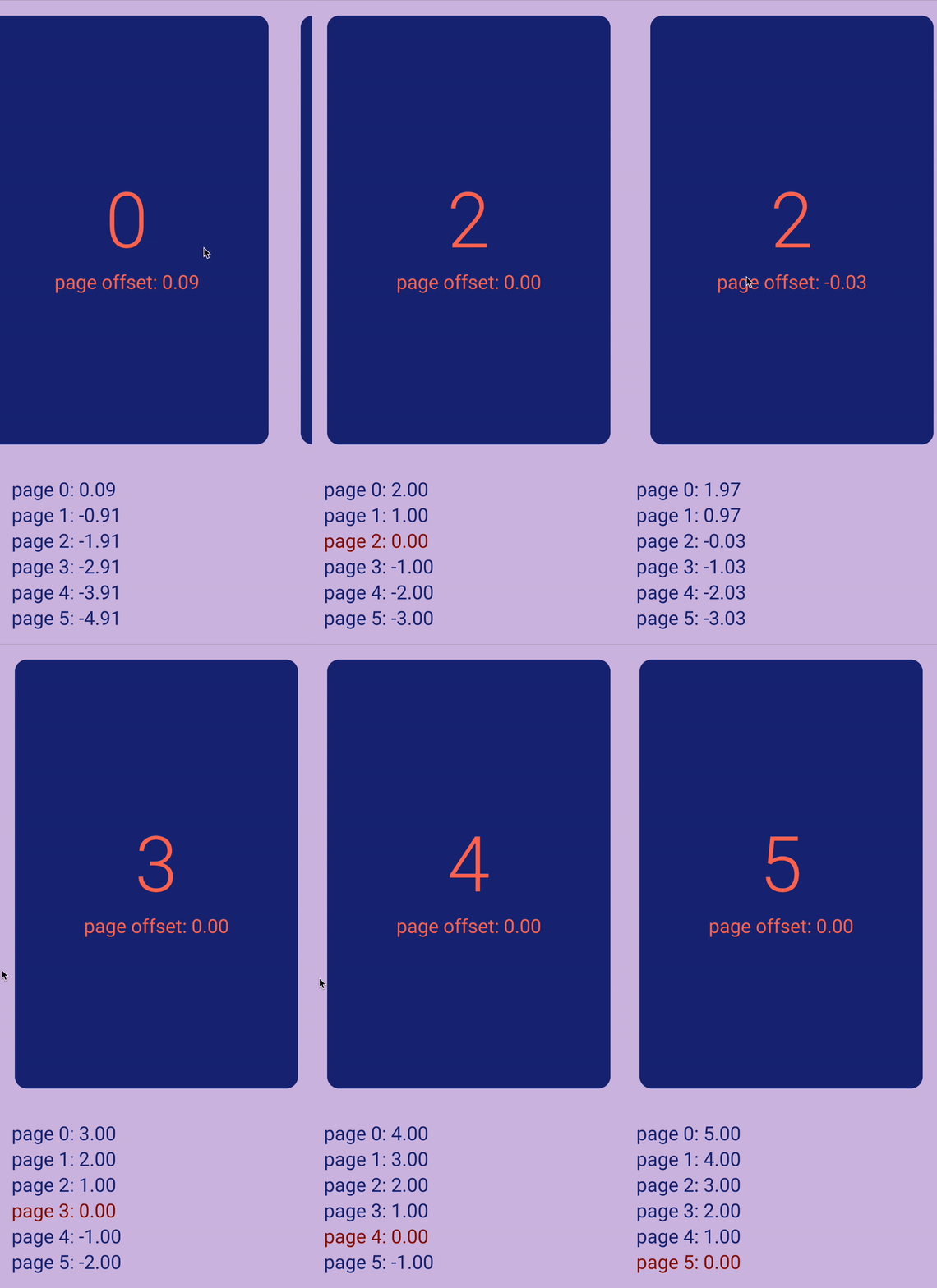
-1.0== page is off-screen to the right0.0== page is settled in the middle and is the current page1.0== page is off-screen to the left
And as seen in the animation, these values go beyond -1.0 and 1.0. For example when a page is two screens to the left, it has an offset of 2.0, three screens to the right has an offset of -3.0, etc.
This gives us great flexibility in developing our animations.
We can simplify this operation to an extension function of PagerState and then we can use it easily in our animations, as seen in Rebecca's article.
// ACTUAL OFFSET
fun PagerState.offsetForPage(page: Int) = (currentPage - page) + currentPageOffsetFraction

// OFFSET ONLY FROM THE LEFT
fun PagerState.startOffsetForPage(page: Int): Float {
    return offsetForPage(page).coerceAtLeast(0f)
}

// OFFSET ONLY FROM THE RIGHT
fun PagerState.endOffsetForPage(page: Int): Float {
    return offsetForPage(page).coerceAtMost(0f)
}
Cube transition
For this transition, we shall leverage rotation and scale functions on compose views to create the illusion of a rotating cube.
First step is to rotate our pages inside the Pager.
.graphicsLayer {
    val pageOffset = state.calculateOffsetForPage(page)
    val offScreenRight = pageOffset < 0f
    val deg = 105f
    val interpolated = FastOutLinearInEasing.transform(pageOffset.absoluteValue)
    rotationY = min(interpolated * if (offScreenRight) deg else -deg, 90f)

    transformOrigin = TransformOrigin(
        pivotFractionX = if (offScreenRight) 0f else 1f,
        pivotFractionY = .5f
    )
}
Inside a graphicsLayer modifier for the page, we need to check if the page is on the right or on the left. This will determine the degrees and origin for the page rotation.
If a page is going off screen to the right, we shall rotate the page 105º around the Y axis and -105º if heading off screen to the left.
I chose 105º to create the illusion of a 3D perspective. But actually rotating a composable 105º causes a reversed version of the view to appear, specifically with the page scrolling to the right. There are multiple ways around this artifact, but I chose to just cap the rotation to 90º.
As for the origin point, we need pages scrolling to the right to pivot along their left edge. And pages scrolling to the left pivot along their right edge.
This gives us this animation.
It's looking good already, but there are some more additions that would sell the 3D effect even more. One is to dim a cube face as it turns away from the center. This gives the illusion that the light is pointed at the center and it gets dimmer as we move away from this point.
This can be done with a drawWithContent modifier where we add an overlay with the alpha corresponding to the page's offset.
.drawWithContent {
    val pageOffset = state.offsetForPage(page)

    this.drawContent()
    drawRect(
        Color.Black.copy(
            (pageOffset.absoluteValue * .7f)
        )
    )
}
One more thing we can add is a shadow beneath the cube that rotates as we move it.
val offsetFromStart = state.offsetForPage(0).absoluteValue
Box(
    modifier = Modifier
        .aspectRatio(1f)
        .offset { IntOffset(0, 150.dp.roundToPx()) }
        .scale(scaleX = .6f, scaleY = .24f)
        .scale(scale)
        .rotate(offsetFromStart * 90f)
        .blur(
            radius = 110.dp,
            edgeTreatment = BlurredEdgeTreatment.Unbounded,
        )
        .background(Color.Black.copy(alpha = .5f))
)
Here we add a Box in a layer below the HorizontalPager and scale it down to somewhat fit the perspective. Next we rotate it relative to the offset from the first page. And finally we add a blur modifier.
Take a look at the before & after and see how much believable the 3D effect is after adding shadows.

Circle reveal
Next, we shall create a circular reveal animation that will clip the incoming page in a growing circle, until it fills the screen. It will look like this:

To achieve this, we start with the graphicsLayer modifier.
.graphicsLayer {
	// MAKE THE PAGE NOT MOVE
    val pageOffset = state.offsetForPage(page)
    translationX = size.width * pageOffset

	// ADD THE CIRCULAR CLIPPING
    val endOffset = state.endOffsetForPage(page)

    shadowElevation = 20f
    shape = CirclePath(
        progress = 1f - endOffset.absoluteValue,
        origin = Offset(
            size.width,
            offsetY,
        )
    )
    clip = true

	// PARALLAX SCALING
    val absoluteOffset = state.offsetForPage(page).absoluteValue
    val scale = 1f + (absoluteOffset.absoluteValue * .4f)

    scaleX = scale
    scaleY = scale

	// FADE AWAY
    val startOffset = state.startOffsetForPage(page)
    alpha = (2f - startOffset) / 2f

}
In the modifier, first we need to make the page stay in one position and not to move horizontal. We can do that by offsetting the page with the width multiplied by the pageOffset.
Next we add the circular clipping. Since this is only affecting pages coming from the right, we use endOffsetForPage() function. The shadowElevation is to add some shadow that follows the clipping.
For the shape, we shall steal the CircularPath from my theme animation article.
It is basically a Shape that expands to fit the entire screen, given a float value as progress and and origin point.
For the origin point, we always want it to come from the right edge. But the Y position varies based on where the user started the touch. offsetY is set from a modifier on the HorizontalPager that looks like this
var offsetY by remember { mutableStateOf(0f) }

...

.pointerInteropFilter {
    offsetY = it.y
    false
}
Finally we need to set clip to true, in order to activate clipping.
To add parallax scaling, we use the absolute offset of the page. The further away from the center, the bigger a page is. This makes outgoing pages expand as incoming pages shrink into place.
And lastly, we want to make the page scrolling to the left to fade away. Since we only want to affect this page, we use startOffsetForPage() to set the alpha.
Movie carousel
For this last effect, we shall make a movie carousel UI. For the poster images, they move with some parallax along with a blur effect. But the bottom is a little more interesting. There is a sliding animation for the title of the movies and star rating. Both of these animate as we move the page. Here is the final result.

Let's go over how to make this.
As always, we start with the graphicsLayer modifier.
.graphicsLayer {
    val startOffset = horizontalState.startOffsetForPage(page)
    translationX = size.width * (startOffset * .99f)

    alpha = (2f - startOffset) / 2f
    val blur = (startOffset * 20f).coerceAtLeast(0.1f)
    renderEffect = RenderEffect
        .createBlurEffect(
            blur, blur, Shader.TileMode.DECAL
        ).asComposeRenderEffect()

    val scale = 1f - (startOffset * .1f)
    scaleX = scale
    scaleY = scale
}
Since all the animations are on the page from the left, we use the startOffsetForPage() for all animations.
First, we slow down the page so that it is still underneath the current page and we achieve a parallax effect. We do this by setting translationX to part of the page's width.
Next, we fade and blur the page. The alpha will be 50% when the page is to the left and 0% when the page is 2 indices behind.
Lastly, to make the current page more prominent, and also to get a slight 3D effect, we scale down the page a little as it moves to the left.
Top part is now done. For the movie title, we use a little "Inception" and use a VerticalPager. This is a Pager that the user can not control directly.
val verticalState = rememberPagerState()

VerticalPager(
    pageCount = movies.size,
    state = verticalState,
    modifier = Modifier
        .weight(1f)
        .height(72.dp),
    userScrollEnabled = false,  // <---
    horizontalAlignment = Alignment.Start,
) { page ->
    ...
}

LaunchedEffect(Unit) {
    snapshotFlow {
        Pair(
            horizontalState.currentPage,
            horizontalState.currentPageOffsetFraction
        )
    }.collect { (page, offset) ->
        verticalState.scrollToPage(page, offset)  // <---
    }
}
Here, we create a VerticalPager as usual, except that we set userScrollEnabled to false. This makes it inaccessible to the user and can only be controlled by us. We then create a snapshotFlow that collects values from the HorizontalPager with all the posters. As the user scrolls that Pager, we set the same values on our VerticalPager with titles. Et voila!
Last but not least, the star rating. For this, we need to get the interpolated rating as we scroll from page to page.
val interpolatedRating by remember {
    derivedStateOf {
        val position = horizontalState.offsetForPage(0)
        val from = floor(position).roundToInt()
        val to = ceil(position).roundToInt()

        val fromRating = movies[from].rating.toFloat()
        val toRating = movies[to].rating.toFloat()

        val fraction = position - position.toInt()
        fromRating + ((toRating - fromRating) * fraction)
    }
}

RatingStars(rating = interpolatedRating)
If there's a cleaner way of doing this, let me know. Please no judgements on my math :D
After we get the rating, we pass in the value into the RatingStars composable which handles the animating the stars.
And that's all for now. I hope you create some amazing Pager animations.
Thanks for reading and good luck!
Subscribe for UI recipes
